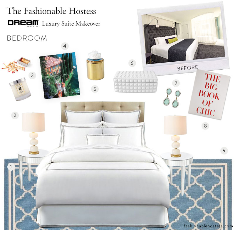

Earlier this year, the Dream Hotel in Midtown approached me to help them with a very cool project. Their Guest House suite which is the nicest suite in the entire hotel, starting at $1500 a night needed a makeover. The goal: to brighten up the room with fun new accents and colors while keeping with it’s cool mod vibe, so I headed over to take a look and give some feedback. What I came back with is below… shots of the before and my recommendations for easy adjustments that will make a huge impact! Read on to see what I recommend per room!
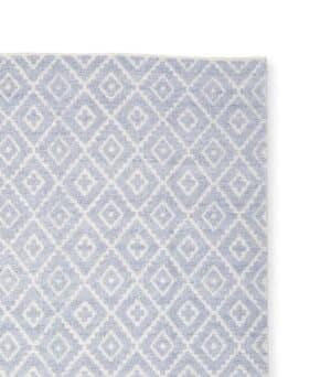
Currently the master bedroom in the Guest House suite is quite dark with deep purples and greys as the main accent colors, so I would recommend lightening the mood by swapping out some key pieces like the rug, side table lamps, and bedding. By bringing in a pale blue rug {here} with a white pattern, the room will immediately look bigger and brighter. Then I love these mirrored side tables {similar} and Abacus table lamps {here} as a compliment. Replacing bedding is an easy swap that can do wonders for a room. Since they want it to be conducive to men or women guests, I like the clean and sophisticated look of this Hudson Park bedding {here}. The finishing touches are an array of accessories to make the room seem more homey.

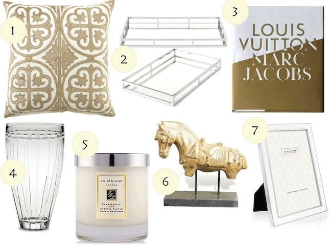
The Guest House’s main living room has a swanky Mad Men vibe with it’s funky lighting and mod bar stools, but the mish-mosh of fabrics and prints take away from how chic it should be. Immediately I recommended to remove the drapes behind the couch {which cover a blank wall} and replace with a statement art piece like this Proenza Prints piece from TheseFineWalls.com. Then I suggested re-covering the couches to all be the same color fabric {rather than mixing and matching prints} and choosing couch pillows in a range of gold textures {here}. Hard to tell in this picture but important to note, was that the kitchen and bar area were missing some swanky kitchen essentials. I recommended displaying coupe glasses {here}, a glass decanter {here}, and a stone cheese board {here} packed with cheeses and nuts when guests checked in.

On the opposite side of the Guest House’s living room is a dark built-in bookshelf shoved tight with old books and black accessories. I suggested to brighten up the shelves by painting them white so their current assortment of accessories would really pop. If painting seemed to be too much of a burden, then I suggested to swap their accessories for a much brighter and lighter assortment so they wouldn’t get lost. I love this Jonathan Alder horn sculpture {here}, this Jonathan Adler quartz object {here}, a vase filled with white flowers like Hydrangeas, and something with a pop of color like these patterned Missoni candles {here}.
This was such a fun project! If you are interested in hiring me in as a design consultant for your company or home, be sure to contact me here!


