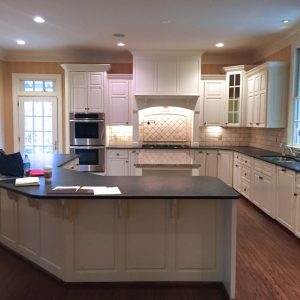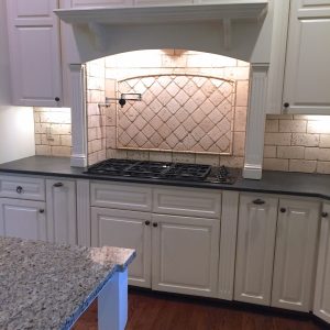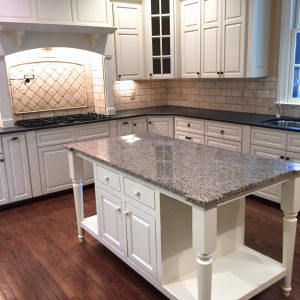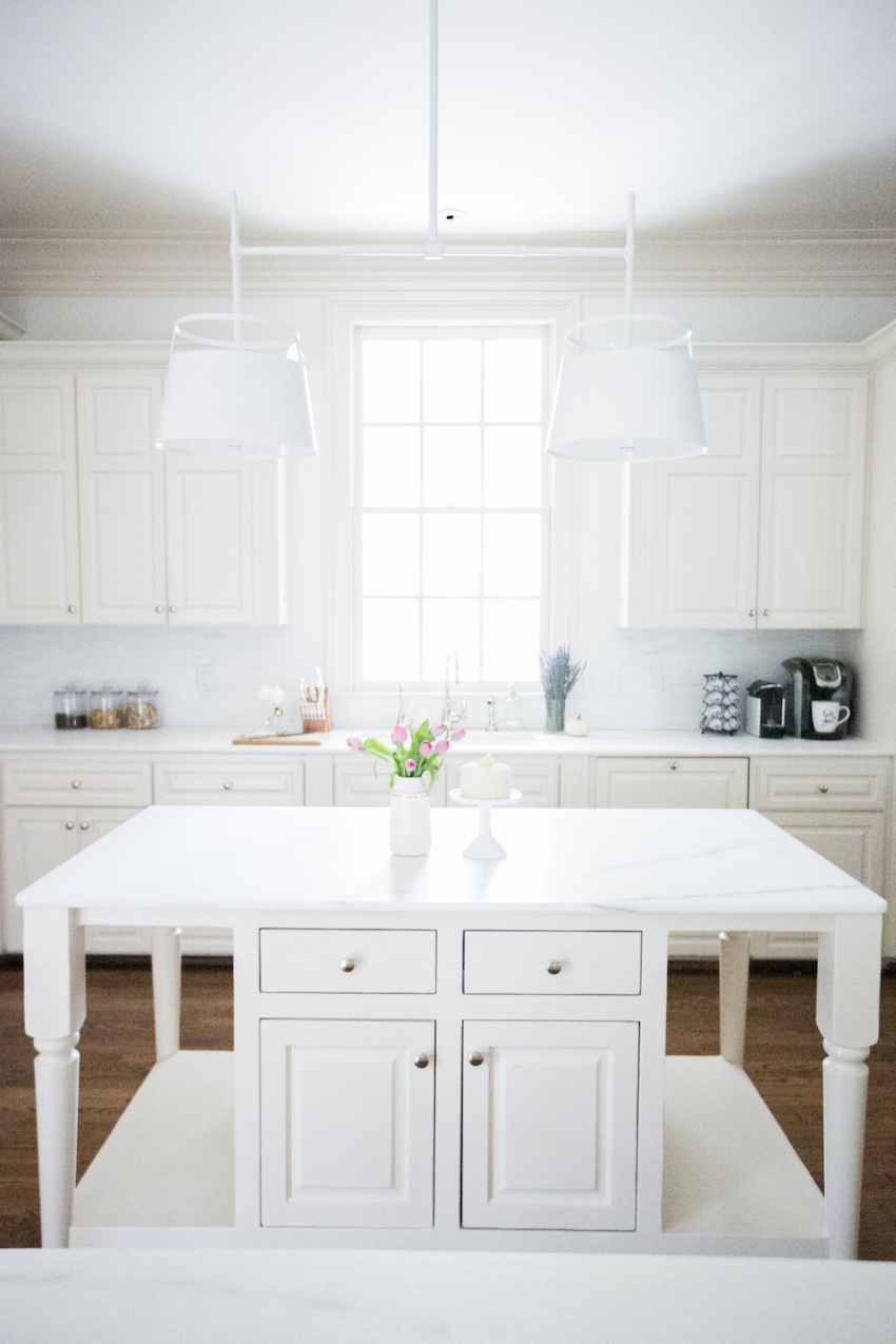
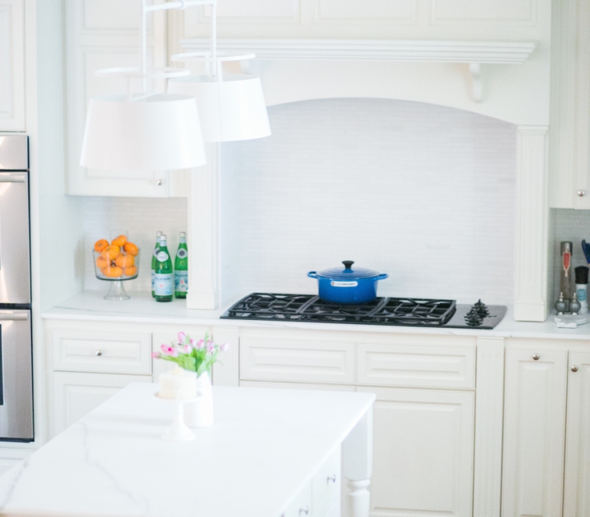
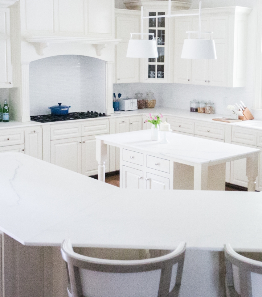


I am so excited to FINALLY share my beautiful all-white kitchen on the blog. A little back story… when I first got to work on this house eight months ago, the kitchen was everything I dreamed in terms of size and shape but it was completely the opposite of what I wanted in color and lighting. It had black and speckled granite countertops, peach colored cabinetry, antique brass light fixtures, paisley wallpaper, and a dark stone backsplash — see the bottom of this post for before shots that will blow your mind! {Or if you check out my instagram and look through the hashtag #TNChateauFH you can follow some of the evolution of my house, specifically the kitchen in this picture and this picture!}.
So much like the rest of the house it was really about giving the space a color revamp! So we started by picking a beautiful white marble {and this was no easy task!!}. Now, to preface, people have very mixed feelings about marble and to be honest so do I even now! I wanted marble badly but was nervous about the rumor of staining. I now have lived here four months and have had it sealed twice. We haven’t had any stains yet, but I must say we are very neat and careful on a consistent basis. On the flip side, the stone could not be more stunning, and everyone comments on how gorgeous it is, so I am beyond in love with it and happy with my decision. The marble is a white Bianco Oro marble that we purchased in Miami, and the bright white color with very little veining instantly lightened up the room. We then matched the stone countertops to a white stone backsplash {which also came from Miami, from a company called NaturaliStone} that was called Thassos #5.

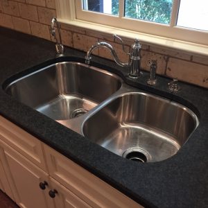
Next we ripped down the wallpaper and painted the walls and cabinetry with Benjamin Moore White Dove OC-17 in Aura Interior Matte Finish. A fun detail that we didn’t think would make a huge difference but in hindsight was an amazing choice to change, was our kitchen sink! We decided to replace the old sink basin to an all-white Kohler sink with a brand new Kohler faucet with matching hot water spout {how pretty is this picture!!} and it just looks so elegant next to the marble.
Then of course the lighting really made the room feel FH-esque. Above the kitchen island we choose a double light, the Carolyn Double in white by Urban Electric and then above the breakfast table we chose something a little bit more feminine, the Anya Blown-Glass Chandelier from Serena and Lily.


For both the overall design and also the furniture {which was all custom made} we worked with Charlotte Dunagan Design Group, a design firm based in Miami. The round breakfast table and matching bar stools were a vision from my designer {the founder Charlotte} who loved the look of soft grey’s matched back to the whites in the kitchen. Then since we owned Modani New Louis Chairs in patent {which I love because they look dressy but are so easy to wipe off}, we tied back with white patent in the bar stools.
Overall I am most excited about the amount of space I have for displaying food come party time. I love to have huge buffets during my dinner parties and now I dont have to worry that they are getting in the way of my cooking space! Hope you enjoy this sneak peek into the #TNChateauFH.


See before shots here:

